
Meet Kevin
Kandace: Hi Kevin. Why don’t you tell us a little bit about your design background, like how you got into design, especially coffee design.

Image via Kevin’s Instagram
Kevin: Yeah, coffee was a little bit of a leap. I started off going to art school in the University of Michigan. I’ve made my way out West to a little bit of tech design and I was gearing towards surf and skate and that whole world, which you can see in my illustration work, but that was a little more corporate of a world than I expected and I burned out and decided I wanted to be a barista instead.
I was just like, “I’ll freelance on the side, I’ll just have some fun with design on the side and I’ll be a barista during the day,” because I love coffee and I love customer service and all that. That led to me working at a Verve wholesale account and, when they realized I had some background in design, they brought me into their office to help them and then that just kind of grew into this niche market for me.


I was with Verve for two years and Four Barrel for three years. Now, I’m working for myself. Still dabbling in some coffee, but now I’m able to expand out to lots of other industries.
Kandace: I thought that you have been doing more surf these days?

Image from Kevin’s Instagram
Kevin: Yeah, I have a little more. I still have some connections down there, which is exciting because I can do some apparel. I just did some stuff for Huntington Surf & Sport. It’s a bigger small surf shop down in Huntington.
Then, I was able to do some stuff for Reef, which was exciting. I get to dabble in both worlds because skate and surf was really what got me excited about design back when I was younger.
Project / New Packaging for Four Barrel
Kandace: Awesome. What was your role in the recent Four Barrel packaging redesign?
Kevin: Art Director was my position at Four Barrel. It was an interesting process because we worked in-house on it, which has its pros and cons.

Original Packaging. Check out our first Unpacking Four Barrel Episode.
The pros are you have complete, well, it’s the same pro and con actually, is that you have unlimited amount of time to really work at this thing and hone it. I was designing, I was art directing and illustrating for it, but in addition the three owners (Jodie, Tal and Jeremy) were also art directing and we were kind of working as a team on the project in-house.
We almost had a complete design. We were all pretty excited about it, pretty happy with it and then we made a bunch of mock-ups and put it up on the shelf in our café and we were like, “Oh, this … No, this one’s not the one.” Once we see it on the shelf and really step back, it’s not popping off the shelf, it doesn’t have the power we’re wanting. It’s kind of like, “Alright, back to the drawing board.”
It wasn’t until these that everyone started getting excited and it started feeling like, “Okay, that’s a good energy. There’s something exciting happening with these.”


We wanted espresso to be set apart because Friendo Blendo is, it’s their flagship. They’re kind of known for it, it’s very iconic and they’ve had it from the very beginning. We knew we wanted to set that apart.

Check out Unpacking Four Barrel revisited.
Kandace: Do you have an idea of how artists are being brought in? Is it like friends or, I mean does it change all the time?
Kevin: You know what, let’s see …
Kandace: Our process of bringing on coffee roasters for the show, it’s anything from friends to people writing to us, to, I mean there isn’t a super formal process.
Kevin: We reached out to a local San Francisco artist, Paul Madonna, and he’s an old friend of theirs and he was more than happy to be a part of it and be a part of the launch.
Isabella Dawid Wolf. She’s a Polish tattoo artist, I believe, living in London, and I was just a fan of her work. Over the course of the year of doing that project, the owners became a fan of her work as well. She’s primarily a tattoo artist, so much less design world, so she was also just excited to get to work on something else.
Kandace: Yeah, well, it goes so well with, I mean it’s obvious it’s different artists, but it really does have a cohesive feel. I think you guys really nailed that…
Kevin: It’s so simple because it’s just like, we thought of it exactly like doing a wine bottle, and that’s even part of the reason for the depth of the black. You want it to pop off just like on a wine bottle.
I think it turned out really well with a lot of information and hopefully, as time goes on, these things become collectables almost. I would totally save which bag I like if there’s an illustration that I knew was going to disappear, like, “I want to save that one.” It’s also a good visual reminder, it could be like, “Oh, the one with the Siamese twins on the back. That was the one I really liked, I can’t remember the unique farm name or which country.” It’s nice to have that little indicator as well.
Kandace: Yeah, and these labels feel really nice, too. I mean, they’re like thicker, they’re not just …
Kevin: Yeah, they’re very legit wine labels, again. I reached out to a wine label company in the East Bay and I just said, “Okay, you’re used to dealing with wineries, how will that work with coffee?” We changed things a lot and it’s basically a similar process. They’re like, “We’re used to doing a bunch of artwork and then having to swap out the name.” We’re used to quick releases, which coffee always comes down to the wire. You’re trying to figure out what beans you’re going to get in, what you can roast, so wine labels made a lot of sense.
Kandace: This feels like a thoughtful evolution, not like you guys just went into a totally different … It’s really interesting how complex and simple it is at the same time, in a way.
Kevin: Totally. I’ve seen other coffee brands go from the hand-stamped bag, when that’s all you can afford, to jumping to a nice foil bag that has bright colors and glosses and foil and then you’re trying all these different things and then it doesn’t even look like the same company. Four Barrel has never been about going to that world.
Illustration Style
Kandace: Your illustration style, do you switch it up when you’re working with various clients?
Kevin: Yeah, so it’s been an interesting road. I would say my style did change going from Verve to Four Barrel, even though people can seem to identify my work between the two and say, “Oh, yeah, I thought it was the same person.”

A lot of it comes down to themes. Verve was very focused on outdoors. California has a lot of their focus, like beaches, mountains, all of that sort of thing. Four Barrel, they’re in the Mission in San Francisco. It’s a lot of music and art and history of that area. They’re a little more interested in gritty graphics and Jodie always pushed me to look at old metal T-shirts and old band T-shirts from back in the day. Those themes are helpful to differentiate. Then, when it comes down to the actual graphics or the actual illustrations, different clients all use a much cleaner style. I’ll do really thick, fat lines with thin lines for detailing.
With Four Barrel I looked more at, R. Crumb is an illustrator that I kept in the back of my mind for them. I didn’t use it as a direct reference, but his work is so gritty and dark and real. You look at it and there’s tons of little details, lots of little lines and dashes and you can see that in my work for Four Barrel. I started adding a lot more shadow work and a lot more distressing and things like that where I wouldn’t necessarily add shadows for someone else. It does come into play, but I would bet that you can see the similarities between some of my other work.

It’s like a painter, they say that each painter has, like their brushstroke is like a thumbprint. I think you can tell my line work, but simplicity versus complexity.

I drew some stuff for The Mill at one point that was much cleaner and, I don’t know how to describe it, but I just drew a bunch of the homewares and things that they have in their bakery. It was a much different style where one of my coworkers was like, “You drew that? That looks different,” and I’m like, “Well, I’m an illustrator. I can work in different forms,” but I have my preferred style, which is on the bags.
Home Setup
Kandace: Yeah, nice. What is your home coffee setup?
Kevin: It’s the first time in six years that I’ve had to start making my own coffee because I was always at a coffee shop every day. It’s a pretty simple setup. I use a Chemex with paper filter, I use a scale and I do some coffee faux pas, which I use an electric kettle that doesn’t have a gooseneck spout.
Kandace: Oh, for shame.
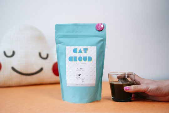
Check out Unpacking Cat & Cloud coffee
Kevin: I know, the shame, and my homemade grinder at home was a hand grinder, so if I’m lazy I have them grind it at the shop, which is another faux pas. Typically, right now, I’m drinking Cat & Cloud at home, they’re my local shop and they’re right down the street.
Kandace: Oh, they are?
Kevin: Yeah, they’re not far at all. I’m always in …
Kandace: That’s got to be really nice.
Kevin: Yeah, so pretty simple setup.
Kandace: I’m always fascinated about what people who have worked in coffee or have coffee at their work all the time and then you go home and you’re like, “What am I going to do for myself now,” because you’re used to good coffee, right?
Kevin: Exactly. To me, the weighing of the coffee is the most important part. The grind is important, but I’m going to get ground at the shop, so it’s at least a good grind, it’s just not fresh. I have gotten everyone in my house to use the scale, so that’s something. Otherwise, I keep it pretty simple.